An author homepage has a demanding job. It must tell a new visitor who you are, what you write, and where to go next—without making that person search through a crowded menu or a long biography. Treat the page as a guided path for readers, not a storage room for everything you have ever published.
The best starting point is not a color palette or a new theme. It is a decision: what is the most useful next step for the reader arriving today? Once that choice is clear, the rest of the homepage becomes easier to organize.
Choose one primary job
A homepage can introduce your work, display several books, collect email subscribers, announce an event, and link to interviews. It should not ask every element to compete for equal attention.
Choose one primary action based on your current publishing stage. For a new release, that may be “Read about the book.” For an established series, it may be “Start with Book One.” Between launches, the strongest action may be “Join the newsletter.” Give that action the most prominent button and let the other paths support it.
Open with identity and relevance
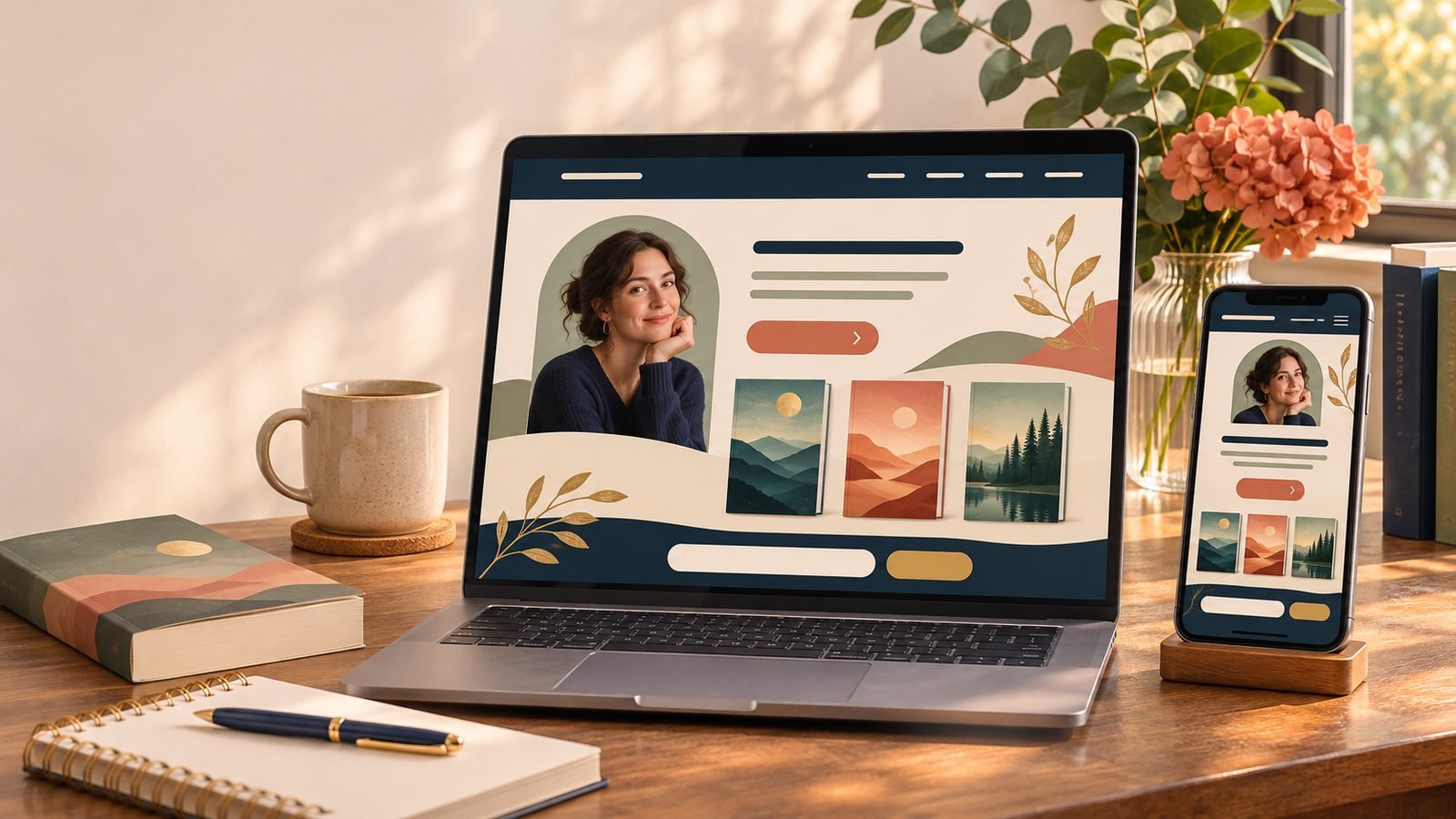
The top of the page should answer three questions in plain language: Whose site is this? What kind of books does this author write? What can I do here?
Use your name, a short line that identifies your genre or reader promise, and one strong image. A sentence such as “Historical mysteries set in overlooked corners of the nineteenth century” gives a stranger more useful context than “Welcome to my website.” Pair it with a button whose label names the destination, such as “Explore the Raven Street Mysteries,” rather than the vague “Click here.”
Feature the right book
Your newest book is often the natural centerpiece, but it is not always the best entry point. If the new title is the fourth installment of a tightly connected series, introduce new readers to Book One and give returning readers a clear route to the latest release.
Show a legible cover, a one-sentence hook, and a direct path to a book page with formats and retailer options. If reading order matters, state it. BookBub’s guidance on current author-website practices likewise emphasizes visible covers, concise pitches, and straightforward retailer links. The homepage does not need the entire description; it needs enough information to earn the next click.
Keep the navigation short
A compact menu helps readers form a quick mental map. Most author sites can begin with Books, About, and Contact. Add Events or News only if you maintain it, and add a Media Kit when journalists, booksellers, librarians, or event organizers need one.
Use familiar labels. “Books” is easier to recognize than a clever phrase that visitors must decode. Put secondary material in the footer instead of stretching the main navigation across the screen.
Use proof with restraint
A short review excerpt, award, or reputable publication mention can help establish context. Use one to three strong items and attribute each one accurately. Link to the source when possible, and check that you have permission to reproduce more than a brief excerpt. A wall of praise can bury the book itself, so keep proof close to the title it supports.
Make the newsletter invitation specific
“Sign up for updates” leaves too much unanswered. Tell readers what you send and roughly how often: a monthly note with new-release news, reading recommendations, and occasional event dates, for example. Ask only for the information you will use, label every field, and link to your privacy policy. A useful invitation sets expectations before the reader submits the form.
Place the form after you have shown visitors what you write, then repeat a smaller invitation near the end of the page. If you use a pop-up, test it on a phone and make sure it can be dismissed easily without covering the content.
Write for scanning and search
Readers scan before they settle in. Use short sections, descriptive headings, and link labels that make sense out of context. Give the homepage a concise, unique page title and a useful search description. Include the phrases readers naturally use—your name, genre, series, and book titles—where they genuinely help.
These choices also align with Google’s SEO Starter Guide, which recommends clear titles, organized text, meaningful link text, and high-quality images placed near relevant content. Google’s broader Search Essentials asks site owners to create people-first content and use descriptive words in titles, headings, alt text, and links. Search visibility grows from clarity; it should not require awkward repetition.
Design for phones and accessibility
Open the finished page on a phone. Check whether the book cover remains readable, buttons are easy to tap, forms fit the screen, and the main action appears before a long stretch of decorative material. Test the menu, every retailer link, and the form confirmation.
Use headings in a logical order, maintain readable contrast, and provide descriptive alternative text for informative images. The W3C image tutorial explains that useful alternatives depend on an image’s purpose, while its page-structure guidance shows how headings and regions help people navigate and understand a page. WordPress also provides practical accessibility guidance for adding alt text and choosing accessible themes.
Run a ten-minute homepage audit
- Your name and genre are clear near the top.
- One primary button names a useful next step.
- The featured book is the best entry point for today’s visitor.
- Reading order and retailer paths are easy to find.
- The menu uses familiar, accurate labels.
- The newsletter invitation explains content and frequency.
- Review excerpts and awards are attributed.
- Images have appropriate alt text and forms have labels.
- The page works on a phone and all links work.
- The page title, search description, and featured release are current.
Review this list when a book launches, a series changes, or an event season ends. A homepage does not need constant redesign. It needs an obvious purpose, current information, and a path that respects the reader’s attention.